Evaluation
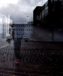
These are two of the photos which i took today during my multiple exposure shoot, i thought these two pictures were good as they both show different things. i like the photo on the right because it shows the town and a person and i think the photo looks quite mysterious as the colour goes form dark to light which i like. the photo on the left is effective because i like how the arrow looks like its sitting on top of the daisys. i also like the contrast of dark and light in this photo and i think both the arrow and the daisys blend well together. my favourite photo out of the two is the on of the right and this is because of the lighting which i think makes the photo look very interesting. however to make it better i could have positioned her more to the left as this way she would have looked bigger than the building and it would have blended together better.

How i could use this
I could use this technique because my personal project is based around marketing and advertising, therefore i could use multiple exposure to make my photos look more appealing and to my audiences. i think this technique would come in handy because it will enable me to included a range of photos in one and this will be helpful when doing my topic as it means i can plan a range of shoots with different ideas. The photo below shows how multiple exposure can be used within my topic because the multiple exposure has made it look more interesting and worthwhile to look at. therefore this technique would be used in marketing.


No comments:
Post a Comment